BRANDING | PERFUME OIL
CHRISTOFFERSEN
To create the identity and label for a new scented oil brand that Is sensorial yet strong. Christoffersen pays homage to the client’s mother, and the brand had to evoke the essence of her mother’s natural beauty, honesty and integrity. The ask was also for it to be sensorial but also carry strength. The scope of work involved brand development including a word mark and a label for bottles to hold scented oils for the face and body.
The bottles were sold at various independent retail locations within Vancouver including Charlie & Lee, The Wildbunch and Nectar Juicery.

THE PROCESS
RESEARCH
During the discovery and research session, a quick study uncovered the following to help with brand positioning -
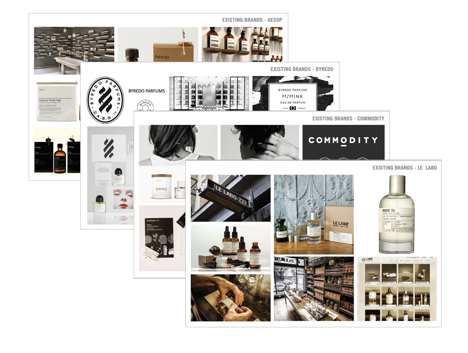
ANALOGUES
COMPETITIVE ANALYSIS
STYLING REFERENCES
BOTTLE AND PACKAGING REFERENCES

TYPEFACE IDEATION
Hei was the selected typeface.

LOGO & LABEL IDEATION
Experimenting with brushstrokes to evoke “olfactory sketches.”

